November Edition!
Clockwise from top left corner:
1. Egyptian Magic Cream - I recently decided to rein in my spending habit and this cult cream came into play. It merges all my skincare into just one cream. Not everyone might like it, though - it's very thick.
2. Clarisonic Mia - Facial brush, I used to use the manual type back in high school and it worked really well for me. This gadget is very overpriced, though. IMHO, just get the Mia and save a few bucks, no need to get the original one.
3. Fruit Salad ice cream from Wall's - LOVE THIS. Nuff said.
4. Taiwanese street snacks (Image courtesy of I Love Taimei) - I've been on a Taiwanese street snacks kick these lately, especially on the sweet potato fries and the tempura (both with plum seasoning).
5. Versense by Versace - Great for hot and humid weather because the smell is fresh and not cloying.
Saturday, November 17, 2012
Homemade Wall Art for Those on a Budget
Look who tried her hands on a little arts & crafts here....me! LOL
So I was taking few days off and took the chance to decorate my bedroom which I've always felt lacking...something.
I bought a couple of cheap frames, thinking I'd frame some Vogue tear sheets I've been collecting over the years. When I got home, though...I got stuck. Then, after couldn't decide what to do for an hour I decided to just wing it; a little folding here, a little glue there...et voila:
I came up with these two! Basically I'm using a folding technique to show random parts of the page and hide the other so it'll have some voyeuristic quality to it, like you get the feeling like you're looking at something familiar and it invites you to look closer and find out.
It can look abstract from afar but upon closer inspection you'd realize it's not so it can be a good conversation piece. You can tell your guests about the actual image and the story behind it.
I don't think this art idea is new but I didn't try to emulate any specific art when I was making these. Funny thing, though, my roommate pointed out there was a similar art in one of Criminal Minds episodes we watched together.
I'm pretty proud of myself, this is a clever way of using those tear sheets that would otherwise be stashed away somewhere in my drawer. It's also worth mentioning that when she first came home, my roommate thought I bought these *smug face* =D
Wednesday, November 14, 2012
Chanel Le Vernis Mimosa : How to Salvage a Wrong Shade of Polish
I bought Chanel Le Vernis in Mimosa back in summer 2011. It is a very pretty yellow, bright and opaque enough to show up on your nails but classy enough not to emulate a teeny bopper. It has very fine shimmery particles but you can't really see them unless you hold the bottle / your nails next to your eyes.
Sadly, the shade is all wrong for me. It got me a bad case of lobster hands and it always looks very painted on. I can't tell you how many times I painted it on only to remove it seconds later. For as long as I've owned the polish, I have yet to wear it in all its glory. It is THAT bad on me. Suffice it to say, Chanel Mimosa is unflattering for my skin tone.
However, there's no reason to waste a perfectly good polish so I came up with a couple of ideas on how to rework Mimosa into something wearable on me.
1. Bubbly Mimosa
These bubbly-inspired nails also serve as my first attempt at gradation nails. You know, the one where you use sponge to create (somewhat) seamless gradation of 2 different colors.
I use China Glaze in Harvest Moon for this effect. Harvest Moon is a gorgeous shimmery copper and part of their Capitol Colors collection (a tie-in with the Hunger Games movie).
I still haven't mastered it yet but i think the uneven border makes for a nice bubbly-like effect.
This will definitely catch people's eyes, perhaps more appropriate for parties and celebrations.
2. Sprinkles nails: Easter Egg Edition
I came up with the second idea after rummaging through my polishes collection and found several colors that looked so great together. I don't know if there's already a name for this effect but I call it 'Sprinkles Nails' because it consists of dots from several different colors - it's basically a 2D version of Ciate's Caviar nails and InStyle magazine actually ran an article of similar idea a few months back.
I use 5 different polishes for this effect: 1 for the base color, and the rest for the dots.
From left to right:
1. OPI Skulls & Glossbones as base color
2.China Glaze - Sea Spray
3. Jessica - Cloud Mine
4. Chanel - Mimosa
5. China Glaze - For Audrey
For the record, China Glaze - Sea Spray was the color that started it all for me. Before it came out, I was never such a polish fiend as I am right now. Then it came out and it started snowballing from there =D
So what you do is, paint your nails with the base color then work your way through each color by dotting it randomly all over your nail, one color at a time. This works best with polishes that have rounded type of brush.
The end result looks somewhat like the colors and pattern you'd use to decorate an Easter egg, hence the name of the design. Definitely eye-catching and not for the boardroom!
The good thing about Sprinkles Nails is that you can experiment with any colors, you can go with themes such as Christmas, Halloween, St. Patrick's Day, etc. or you can just go crazy and mix in any colors, the possibility is endless and each will yield unique result, every time.
Holiday is around the corner so Season's Greetings everyone! ^_^
Sadly, the shade is all wrong for me. It got me a bad case of lobster hands and it always looks very painted on. I can't tell you how many times I painted it on only to remove it seconds later. For as long as I've owned the polish, I have yet to wear it in all its glory. It is THAT bad on me. Suffice it to say, Chanel Mimosa is unflattering for my skin tone.
However, there's no reason to waste a perfectly good polish so I came up with a couple of ideas on how to rework Mimosa into something wearable on me.
1. Bubbly Mimosa
These bubbly-inspired nails also serve as my first attempt at gradation nails. You know, the one where you use sponge to create (somewhat) seamless gradation of 2 different colors.
I use China Glaze in Harvest Moon for this effect. Harvest Moon is a gorgeous shimmery copper and part of their Capitol Colors collection (a tie-in with the Hunger Games movie).
I still haven't mastered it yet but i think the uneven border makes for a nice bubbly-like effect.
This will definitely catch people's eyes, perhaps more appropriate for parties and celebrations.
I came up with the second idea after rummaging through my polishes collection and found several colors that looked so great together. I don't know if there's already a name for this effect but I call it 'Sprinkles Nails' because it consists of dots from several different colors - it's basically a 2D version of Ciate's Caviar nails and InStyle magazine actually ran an article of similar idea a few months back.
I use 5 different polishes for this effect: 1 for the base color, and the rest for the dots.
From left to right:
1. OPI Skulls & Glossbones as base color
2.China Glaze - Sea Spray
3. Jessica - Cloud Mine
4. Chanel - Mimosa
5. China Glaze - For Audrey
For the record, China Glaze - Sea Spray was the color that started it all for me. Before it came out, I was never such a polish fiend as I am right now. Then it came out and it started snowballing from there =D
![]() |
| Steps 1 - 5 |
The end result looks somewhat like the colors and pattern you'd use to decorate an Easter egg, hence the name of the design. Definitely eye-catching and not for the boardroom!
The good thing about Sprinkles Nails is that you can experiment with any colors, you can go with themes such as Christmas, Halloween, St. Patrick's Day, etc. or you can just go crazy and mix in any colors, the possibility is endless and each will yield unique result, every time.
Holiday is around the corner so Season's Greetings everyone! ^_^
Labels:
Chanel,
China Glaze,
Inspiration,
Nail Polish,
NOTD,
OPI,
Swatch
Tuesday, November 13, 2012
A Shot at Photography
Given my occupation, it's only natural I am attracted to anything arty-fartsy. That, and coupled with appreciation towards what other architects have done to make life a better place, I've pulled up a few of super duper amateurish shots from my collection to share with you here. Why? Because sometimes you just like to look at pretty things =D
I'm keeping the locations/names of the objects so it'll feel more curious, feel free to guess, though...;-p
Wednesday, November 7, 2012
Good Night, and Good Luck, Mr. President.
Somewhere in 2007, I was getting my hair done in a small hair salon back in my home country while reading an article about a would-be American presidential candidate whose name sounded a lot like the most hated terrorist in the world, and said to have spent part of his childhood in my home country. I scoffed at what seemed like the sensationalized journalism.
Fast-forward to 2008, then, as a freshly hired uni grad in a foreign country, I watched Senator Barack Obama rose to power as the first African-American friggin' President. I, together with the rest of the world jumped my couch and wept like hell.
Tonight (or according to where I live, today), President Barack Obama wins the election. I can't tell you how elated I am, and I'm not even an American.
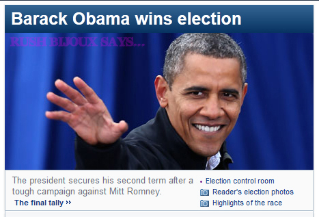
I can't tell you how nervous I was this morning, knowing the election was underway and that in a matter of hours the world could change *hyperbolic much?* lols. And despite my best effort not to, I couldn't help but to constantly check the development every other minute. For the first half of my morning it seemed like Romney was in the lead, I remember having knots in my stomach thinking my world would definitely be a little sadder if he won.
But then i hit the F5 button one more time and there it was. Barack Obama had won.
Call me silly to care so much about another country's election but like it or not, USA does have a global influence so whatever goings-on they've got in their politics, the effects will eventually spread worldwide.
Despite the many issues brought forward by each party, for the most part it felt like this election has been a conflicting battle between wealth vs. sensibility, and judging by how close the race was and the uncharacteristically marked presence of the notorious undecided voters, many of the people seemed to be conflicted as well. After all, it looks like one of those damned-if-you-do-damned-if-you-don't situations: Gunning for wealth only and you'll end up like a certain nation whose economy has progressed so aggressively yet remains unabashedly crooked in every other way. Yikes. Not good for the soul, man! Oh, you'd rather focus on improving the quality of the nation as a whole? You think you don't need money? Whaddya gonna eat then? Good luck on buying that house and those cars that you want!
See what I mean? It's a never ending debate where one argument negates the other because basically, they are of equal importance. How do you choose between these two? But when it does come down to that, I think as an educated person, one should be able to acknowledge the importance of wealth without having to be enslaved to it.
That's why I vouch for Obama. If I were an American, I'd feel comfortable having him as my president. I feel he represents hope. I believe in most things he believes in. I believe in LGBT rights, human rights, women rights, tolerance, equality, kindheartedness, and hard work, more than I believe in wealth as a golden ticket to the solution of every problem faced by a nation.
In addition to that, I like what the First Lady has been doing so far, bringing in obesity awareness to people's attention and advocating healthier lifestyle. I also like how she can stand up in her own rights next to her president-husband and accomplish something on her own, knowing she would've done just that had her husband not been the president. She's one of my role models, I look up to her.
So from this little corner of blogging space, I'd like to congratulate President Obama and wish him well on his second term. Keep on doing what you do best and improve on what you don't.
And last but not least, Good Night, and Good Luck, Mr. President.
Fast-forward to 2008, then, as a freshly hired uni grad in a foreign country, I watched Senator Barack Obama rose to power as the first African-American friggin' President. I, together with the rest of the world jumped my couch and wept like hell.
Tonight (or according to where I live, today), President Barack Obama wins the election. I can't tell you how elated I am, and I'm not even an American.
![]() |
| Wheww...that was one hell of a race now, wasn't it? |
But then i hit the F5 button one more time and there it was. Barack Obama had won.
Call me silly to care so much about another country's election but like it or not, USA does have a global influence so whatever goings-on they've got in their politics, the effects will eventually spread worldwide.
Despite the many issues brought forward by each party, for the most part it felt like this election has been a conflicting battle between wealth vs. sensibility, and judging by how close the race was and the uncharacteristically marked presence of the notorious undecided voters, many of the people seemed to be conflicted as well. After all, it looks like one of those damned-if-you-do-damned-if-you-don't situations: Gunning for wealth only and you'll end up like a certain nation whose economy has progressed so aggressively yet remains unabashedly crooked in every other way. Yikes. Not good for the soul, man! Oh, you'd rather focus on improving the quality of the nation as a whole? You think you don't need money? Whaddya gonna eat then? Good luck on buying that house and those cars that you want!
See what I mean? It's a never ending debate where one argument negates the other because basically, they are of equal importance. How do you choose between these two? But when it does come down to that, I think as an educated person, one should be able to acknowledge the importance of wealth without having to be enslaved to it.
That's why I vouch for Obama. If I were an American, I'd feel comfortable having him as my president. I feel he represents hope. I believe in most things he believes in. I believe in LGBT rights, human rights, women rights, tolerance, equality, kindheartedness, and hard work, more than I believe in wealth as a golden ticket to the solution of every problem faced by a nation.
In addition to that, I like what the First Lady has been doing so far, bringing in obesity awareness to people's attention and advocating healthier lifestyle. I also like how she can stand up in her own rights next to her president-husband and accomplish something on her own, knowing she would've done just that had her husband not been the president. She's one of my role models, I look up to her.
So from this little corner of blogging space, I'd like to congratulate President Obama and wish him well on his second term. Keep on doing what you do best and improve on what you don't.
And last but not least, Good Night, and Good Luck, Mr. President.
![]() |
| Congratulations! |
Thursday, November 1, 2012
NOTD : Spring Gentian by Priti NYC
It's been a while since I last did a post on nail polish. What a shame since I actually bought a polish and been wanting to share how awesome it was with you for some time but I just couldn't muster enough energy to do my nails, but I digress....today my schedule has calmed down enough for me to find time to finally show off that puppy. Take a look at the picture below:
It's Spring Gentian by Priti NYC! Priti NYC is an eco nail polish brand that's been under the radar for some time and they seem to finally gain momentum with several collaboration with major labels such as Stella McCartney. I love their colors especially the seasonal offerings, can't wait for their latest to reach my shore....lols.
Btw, as I mentioned in my previous post about Priti NYC, they always have the loveliest names for their polishes and Spring Gentian is no exception. The vivid blue color was actually what first drew me in, I've been visiting the shop a few times and I always had half the heart to buy this shade but always backed down without fail in the last minute, partly because I worried this shade would be one of those shades that looked good on the bottle but not so much when worn, and partly because I don't wear blue that well because I have warm olive skin tone.
But a month ago I decided to take the plunge and I must say the shade works for me.
Why it works for me? Well, the key is, Spring Gentian is dark enough for me that it doesn't stand out like a sore thumb against my olive skin tone, but it's not too dark it's almost black.
As I said, I don't wear blue well, wrong shade and it'll look tacky and cheap.
Spring Gentian is a true cobalt blue, its tone is not warm nor cool. It has enough depth to make it look like it's not geared towards teenagers, and it contains blue and green micro glitters. The glitter effect is very subtle though, you have to see it under certain light for it to come alive.
It's a very nice color to perk up an otherwise boring outfit but might not be suitable for professional settings.
For you who don't know what Gentian looks like (as I was before I owned this polish, lol), I'm gonna end this post with a picture of Gentian plant (nixed from www.billcasselman.com). Until next time!
![]() |
| Spring Gentian by Priti NYC |
Btw, as I mentioned in my previous post about Priti NYC, they always have the loveliest names for their polishes and Spring Gentian is no exception. The vivid blue color was actually what first drew me in, I've been visiting the shop a few times and I always had half the heart to buy this shade but always backed down without fail in the last minute, partly because I worried this shade would be one of those shades that looked good on the bottle but not so much when worn, and partly because I don't wear blue that well because I have warm olive skin tone.
But a month ago I decided to take the plunge and I must say the shade works for me.
![]() |
| Without flash, in shaded area |
![]() |
| Without flash, in shaded area |
As I said, I don't wear blue well, wrong shade and it'll look tacky and cheap.
![]() |
| With Flash |
![]() |
| With Flash |
![]() |
| Under fluorescent light, no flash |
![]() |
| Under fluorescent light, no flash |
For you who don't know what Gentian looks like (as I was before I owned this polish, lol), I'm gonna end this post with a picture of Gentian plant (nixed from www.billcasselman.com). Until next time!
Tuesday, October 30, 2012
I Heart Taupe: Chanel Safari's Dupe
I love taupe eye shadows, it's versatile and neutral enough for work and casual wear yet still has the twist to keep it interesting. I have two eye shadows that I use in heavy rotation for daily look and one of them is Safari by Chanel. It's a beautiful taupe color with slight shimmer, enough to add depth to the eye lid yet still subtle.
Recently I bought an eye shadow from Bobbi Brown called Heather Mauve (what a pretty name btw!) and when I compared it to Safari they were THIS close to being identical twins. I'd say they're like 98% similar. Take a look at the photos below:
If BB Heather Mauve looks a bit darker than Chanel Safari, it's because I was a bit heavy-handed when swatching it. It is really almost the perfect dupe, honestly you wouldn't be able to tell in real life. Here's the macro shot:
Here's how they look in the pan:
It looks more different in the pan than when swatched. I just don't understand the name 'Heather Mauve' when I really don't see the mauve in the color. Now, I can no longer find the Heather Mauve color on Bobbi Brown's website but they do have a shade called 'Heather', not sure if it's the same one only with different name.
Here are some looks I did with both eye shadows, I use the following for each look:
Look #1 (Bobbi Brown Heather Mauve)
- Base: Urban Decay Primer Potion (Original)
- Base color: Dior 1-couleur eye shadow in 516 Nude Luminescence
- Lid + Crease: Bobbi Brown Heather Mauve
- Outer corner: Chanel 75 Magic Night
- Eye liner: Burberry Eye Definer in Midnight Plum No. 05
Look #2 (Chanel Safari)
- Base: Urban Decay Primer Potion (Original)
- Base color: Dior 1-couleur eye shadow in 516 Nude Luminescence
- Lid + Crease: Chanel 45 Safari
- Outer corner: Chanel 75 Magic Night
- Eye liner: Urban Decay 24/7 Glide-On Eye Pencil in Electric
All looks feature Diorshow New Look mascara in 090 Black.
Bobbi Brown's eye shadows cost SGD34 while I don't have the latest Chanel's price at hand but I'm sure it's somewhere around SGD44.
Until next time!
Labels:
Burberry,
Chanel,
Dior,
Dupe,
Eye Shadow,
Inspiration,
Look Book,
Swatch,
Urban Decay
Subscribe to:
Posts (Atom)